Columbia Law School Admit Portal
WORK
ROLE
UX Developer | UX Designer
DURATION
1.5 Months
Overview
Columbia Law School is one of the top law schools in the United States, boasting an acceptance rate of 11.8% for its prestigious J.D. program. It includes a rigorous application process - the submission of your LSAT, a personal statement, two letters of recommendation, and more.
After applying and waiting for what can feel like ages, the time finally comes and students receive the long-awaited acceptance email that informs them of their admission into the law school, informing them that they are a part of the 11.8%.
Then, the next part of the journey begins.
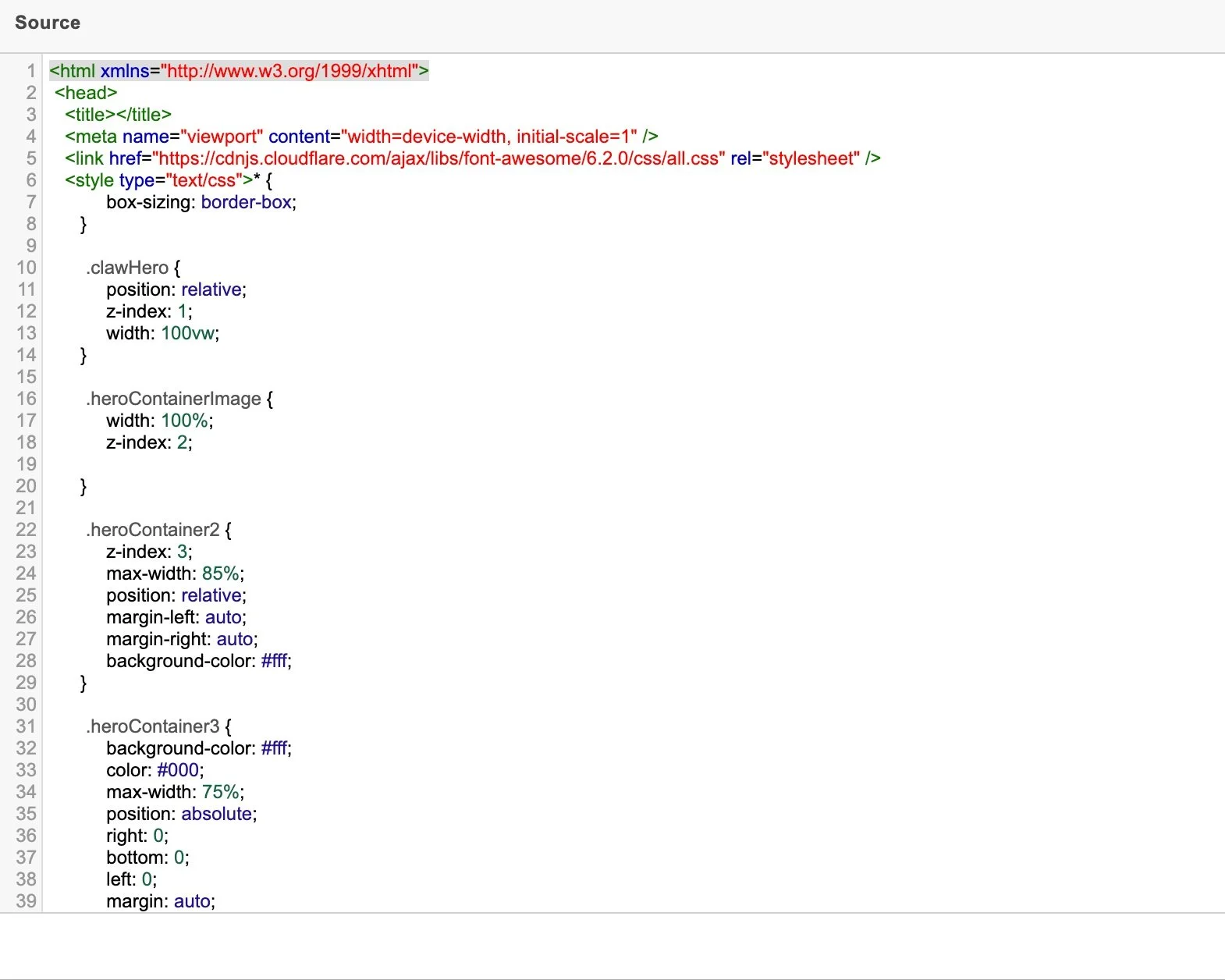
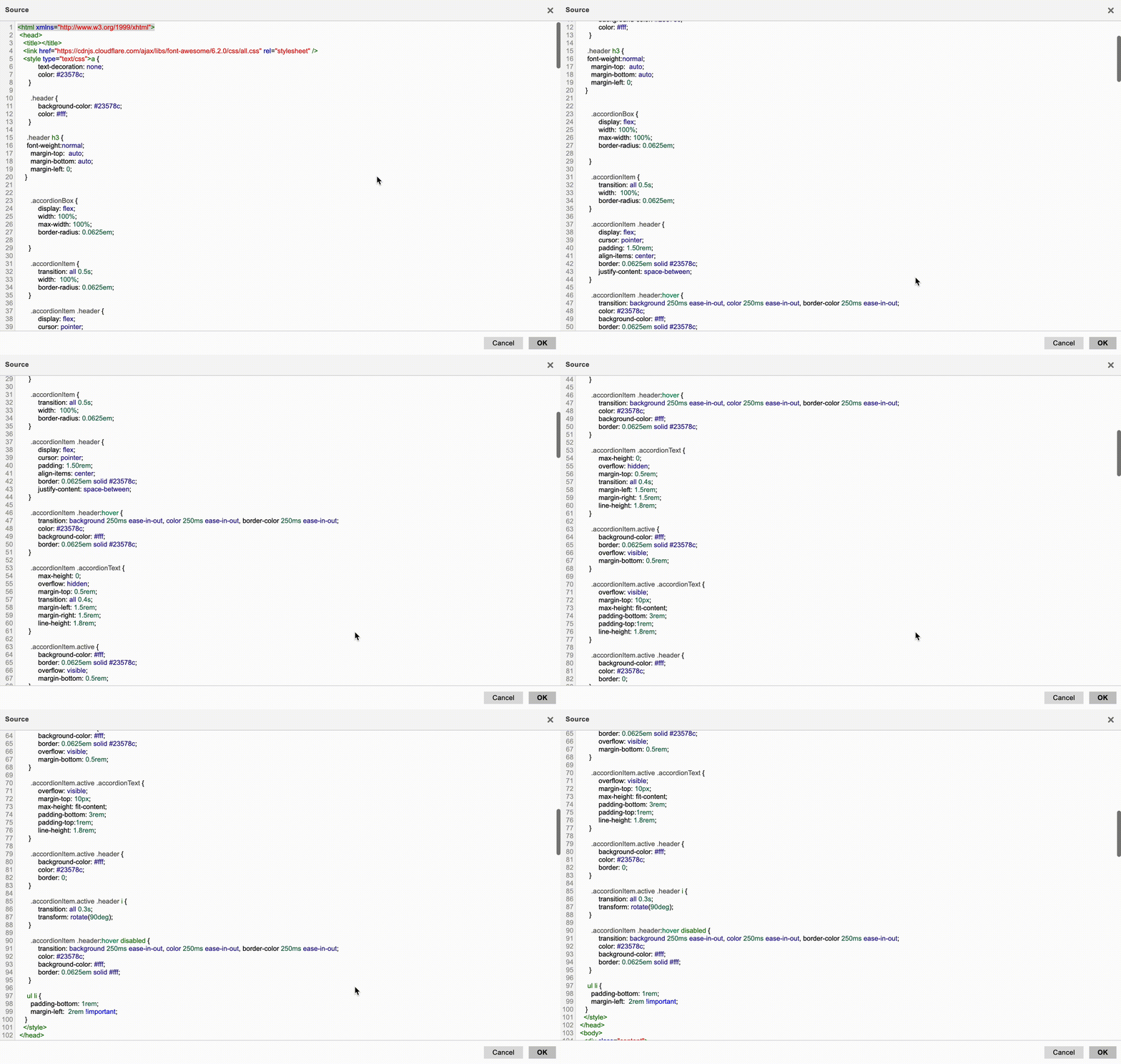
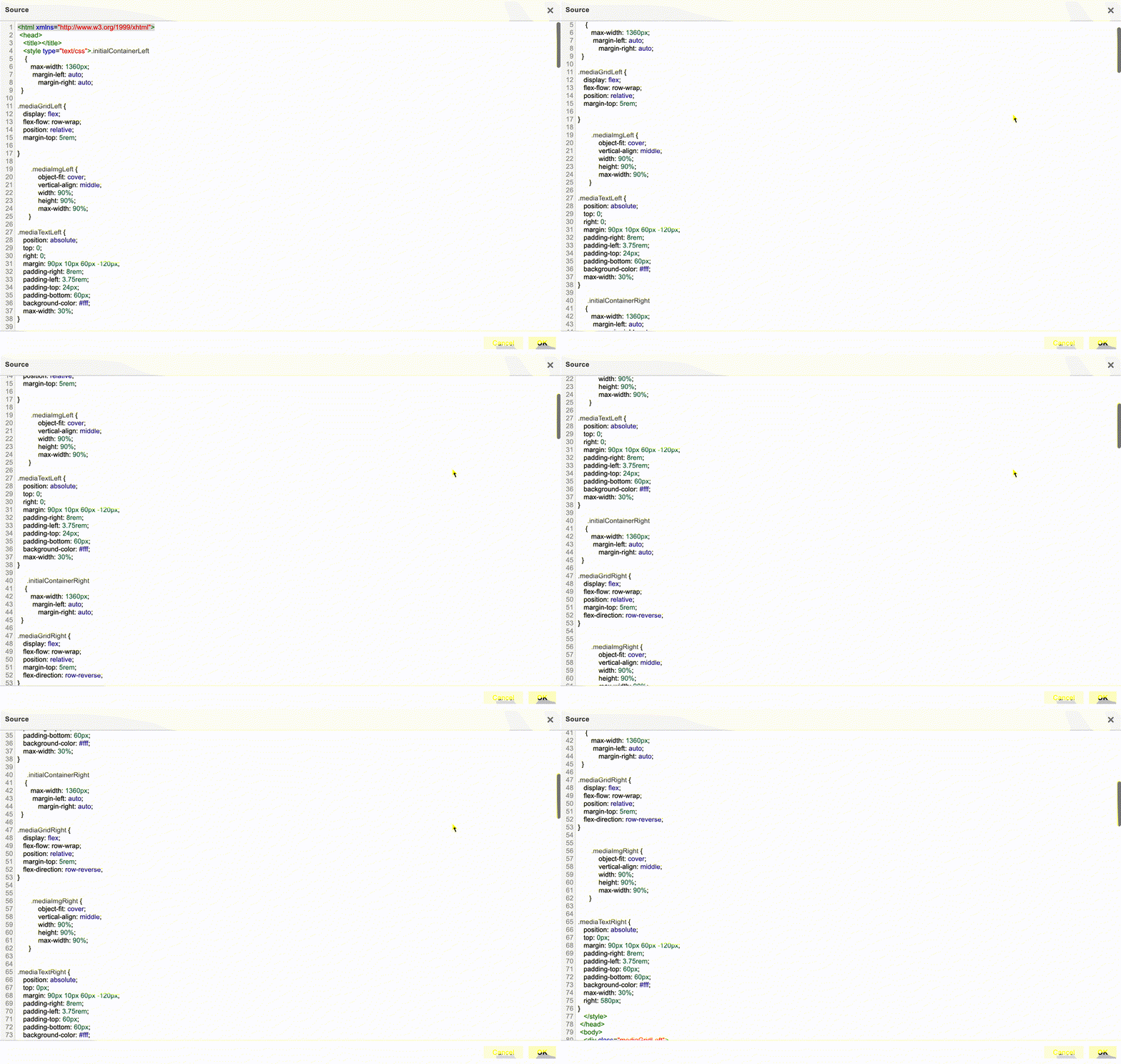
Note: Due to the confidential nature of this project, I am unable to show many project visuals. I will be providing descriptions and code snippets of the work that I’ve done.
Problem
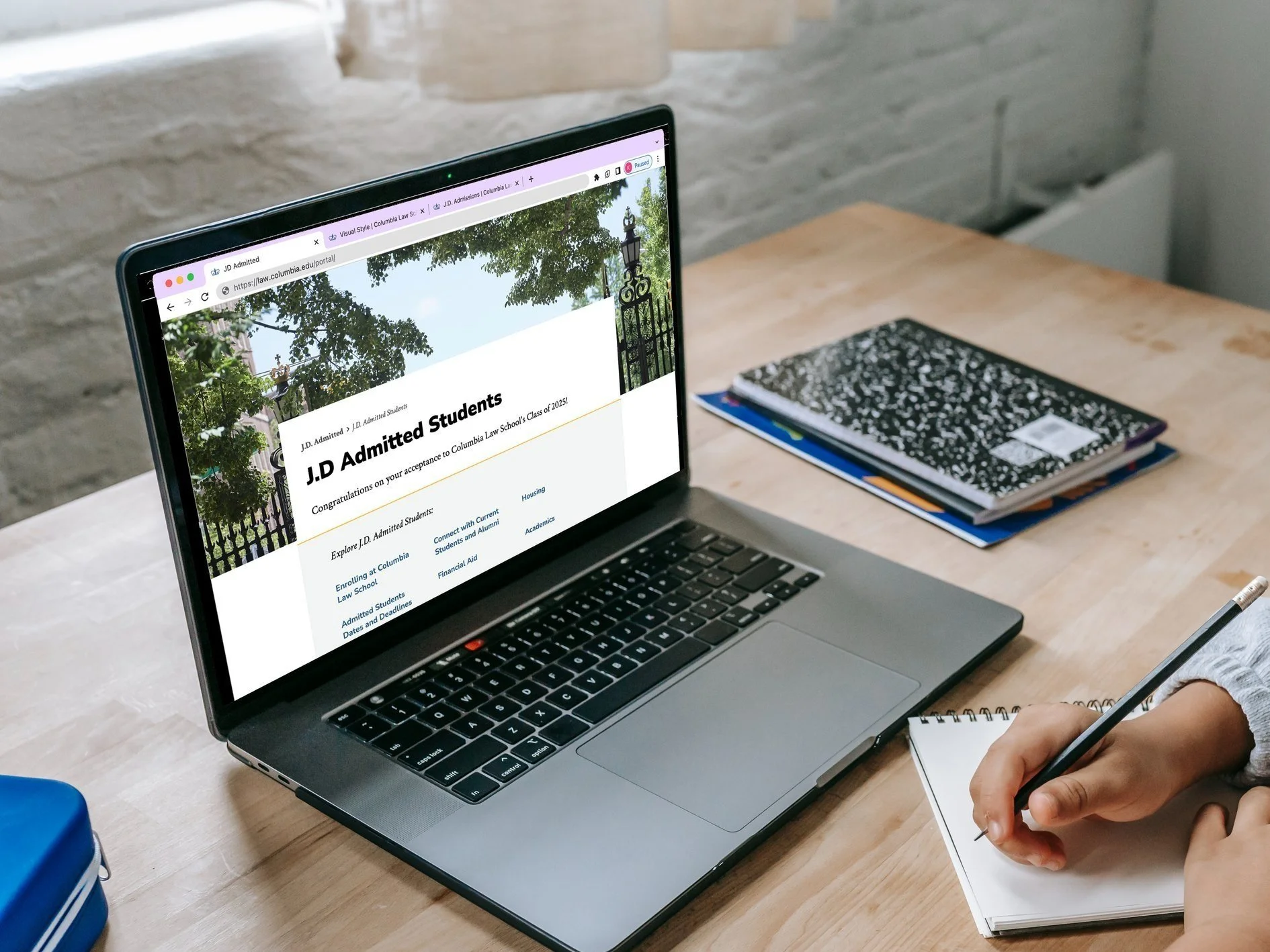
Columbia Law School Admissions (CLS) was quickly approaching a new admissions cycle in the midst of moving its processes to a new platform called Slate. I was assigned the task of creating the Admitted Student Web portal on Slate. The site would also be a supplement to the Admitted Student Handbook and contain information on financial aid, housing, career opportunities, upcoming deadlines, and more as students continue to research and prepare for enrollment.
Early Decision results were set to be released on January 17, 2023, meaning there would be a month and a half to complete the portal.
Solution
Create an Admitted Student Portal while working in the confines of Slate using HTML, CSS, and Javascript. Ensure that the portal’s design aligns with the Columbia Law School brand identity.
Goals
Select and create key pages based off of the Admitted Student Handbook that align with Columbia’s web brand identity.
Ensure that all content is accurate and updated across the entirety of the portal.
Ensure that all elements of the Slate portal function and work responsively across desktop and mobile devices.
Style
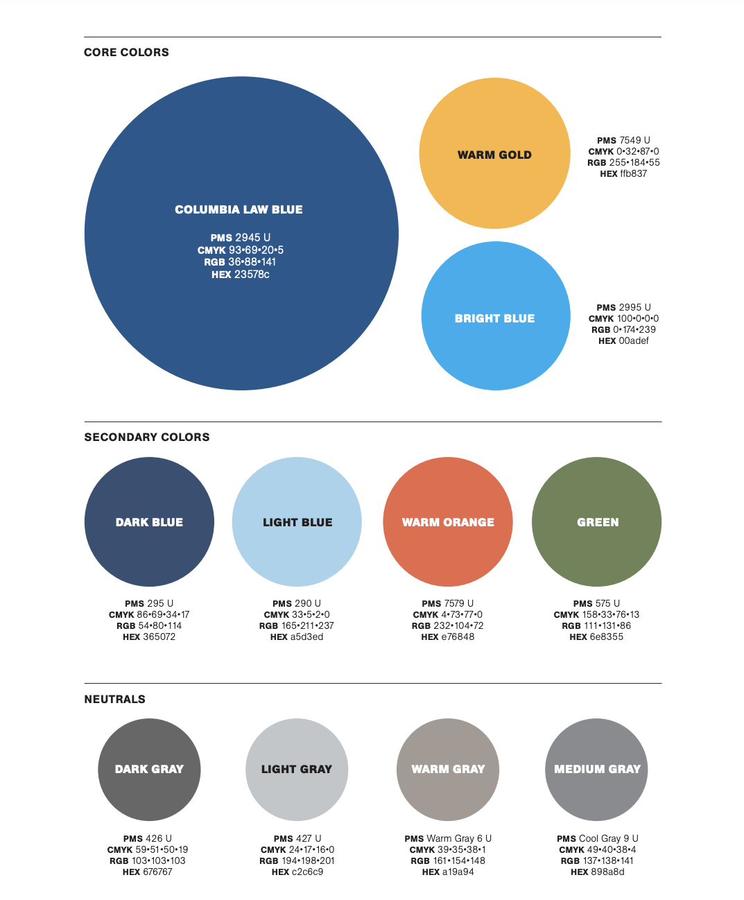
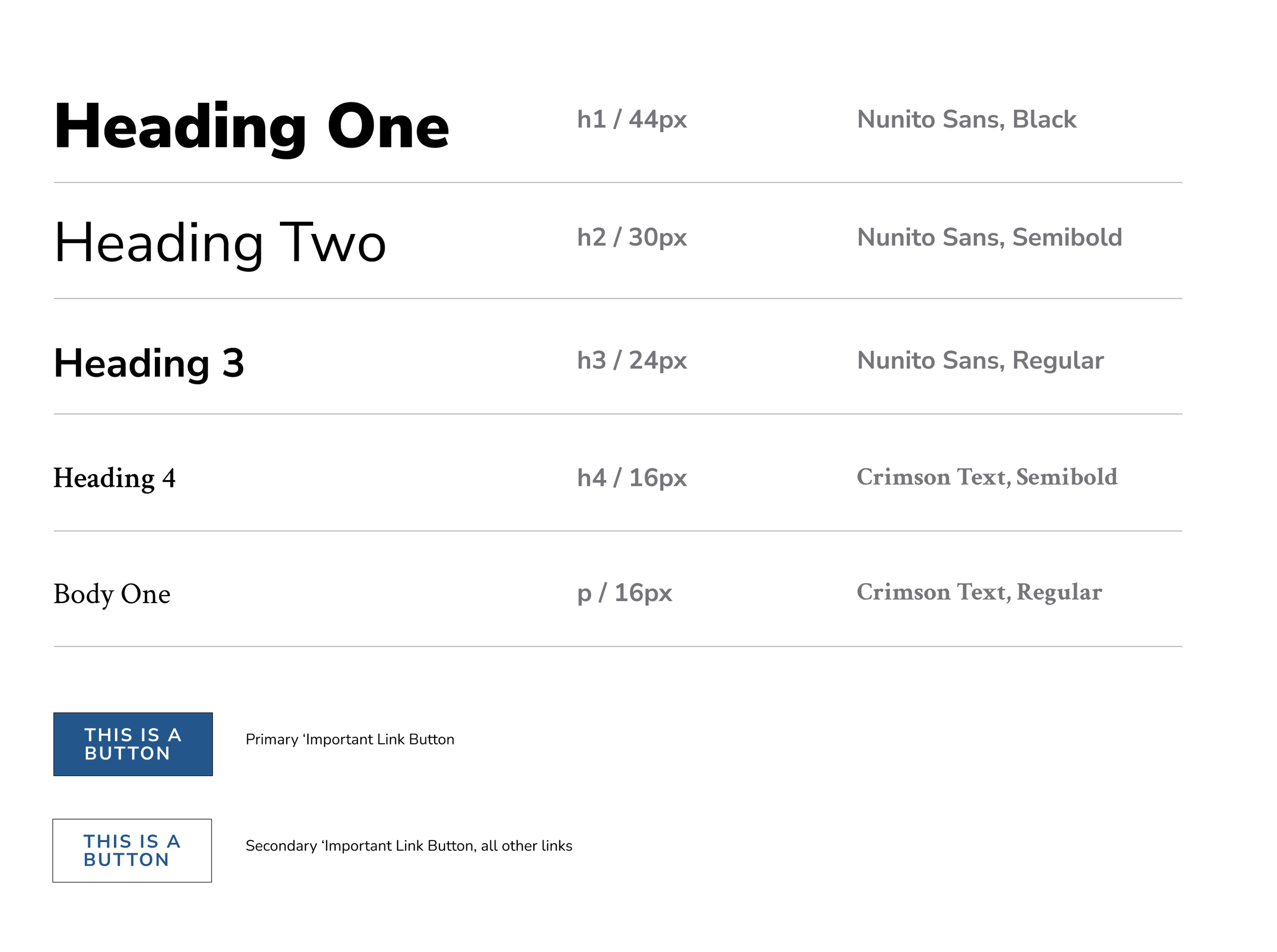
The Law School has a definitive color palette, font choice, and hierarchical set up. The hierarchical set up can be seen across other pages on the Law School’s website, such as the Admissions (different than the Admitted Student portal), Academics, Areas of Study, and Careers pages. Those pages were created with Drupal, and as we were moving processes to Slate, it made more sense to completely start from scratch and create a portal identical to CLS’ brand that would co-exist on Slate.
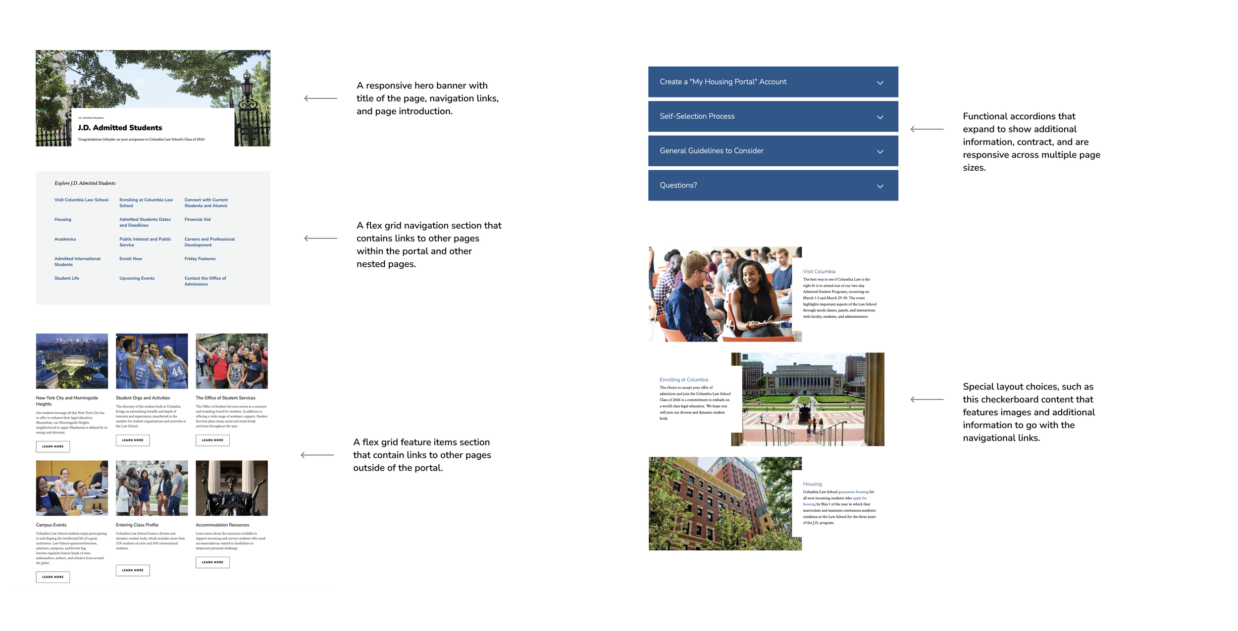
I created a list of features that would need to be on the portal, below.
Approach
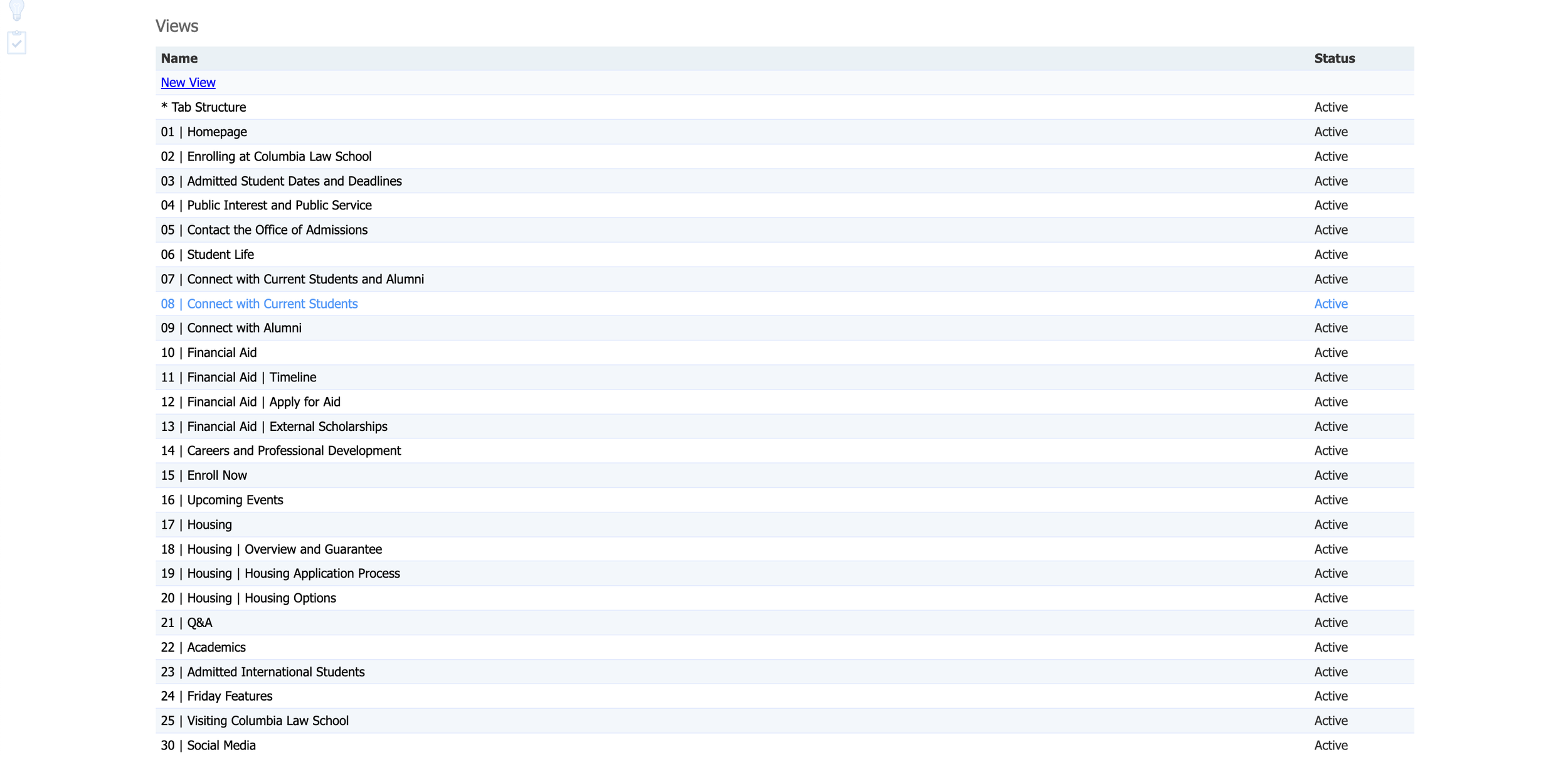
My initial approach was to go ahead and create the pages that were included in the handbook on the Slate platform (with a few new additions). Some pages would be nested within the same category such as the Financial Aid and Housing pages. In total, I set up the framework for 26 pages (or views, as they are called in Slate).
Slate features a drag and drop system when it comes to building out webpages. But in order to create more complex, dynamic pages, the use of coding is necessary. Much of the content is already featured in the handbook, so all it came down to creating the features that I previously highlighted. To achieve this, I used HTML, CSS, and some Javascript. I have not used any of the aforementioned tools in years, so much needed to be relearned.
You are able to code within each individual page, but Slate also features a global custom CSS Rules editor that can be used to implement code that will affect all pages. In addition to that, Slate has an overarching Branding Editor that was created by grabbing all findable elements on the Law School’s website in order to transfer over some styling elements, such as the header and footer.
Hierarchy = Individual CSS rules > Global Custom CSS Rules > Branding Editor.
Challenge 1
The Hero
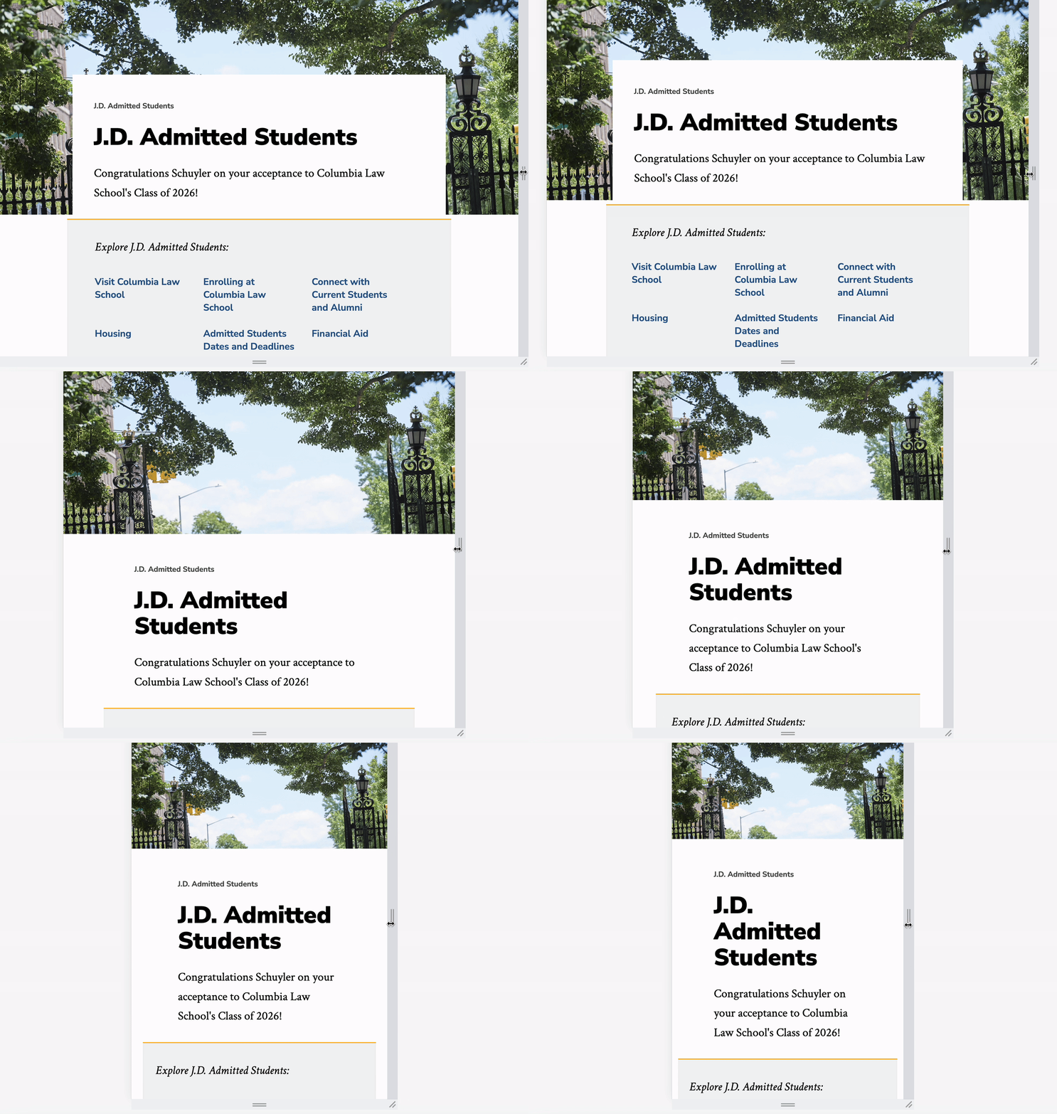
One of the first features I focused on creating was a responsive hero header. This was a bit challenging as the Slate portal webpages had some hidden background code that wasn’t allowing the hero image to fill the width of the page. I had to look for those background elements and set their padding to 0 in the global custom CSS rules.
Then, I had to figure out how to make the white title section stay centered on the hero image across different screen sizes. This proved to be more challenging than I thought it would be. The key here was to adjust the hero image’s container width to 110% and keep the height unset while playing with the margins and positioning.
Challenge 2
The Explore Navigation
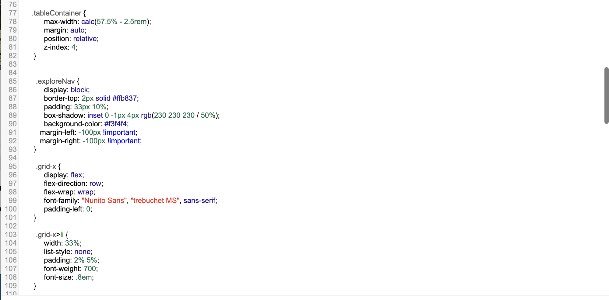
The explore navigation was less challenging to create. It involved the use of a flex grid in order to keep the links contained in a table format. I also wanted to keep the explore navigation aligned with the white title section (margin left and right: -100px !important was helpful for this use case).
Challenge 3
The Feature Items Section
This was also simple to create and just involved creating another flex grid, with the grid contents having a width of 300 and a bit of padding and space between the margins of each item.
Challenge 4
Responsive Accordions
I had to create a variety of classes in order to get the accordions to function properly. I essentially had to create classes for when the accordions were all inactive, their hover states, and when they were active. I used Javascript to create an event listener that would toggle the active state upon clicking an accordion. All that was left was to add transitions in order to make these micro interactions smooth.
Challenge 5
Checkerboard Content
This feature is located on the homepage of the admitted student portal and is somewhat of a decorative page feature that is similar to the explore navigation. It includes images and descriptions under each navigational link.
I created classes for the images, their corresponding text, and an overarching container. Adjusting the text so it aligned properly and created the checkerboard effect involved adjusting the margins and the positions.
Final Steps
and Conclusion
The final step in this process was to link all of the individual pages to the explore navigation on the homepage. Once all of the stylistic features (the accordions, feature items, etc.) were created, they just needed to be implemented across the entire portal.
Eventually, it was decided that since it was so close to the launch deadline and many aspects of the Slate portal were not completely up to standard, the portal would be launched using Drupal instead. By next year, CLS Admissions will use my framework in order to make a full transition to the Slate portal.
Although I was disappointed that some of my work would not be utilized this year, I quickly realized that this was not the case. I had given CLS Admissions a
well-structured framework to work with and use for the next admit cycle, in a short timeframe while almost completely relearning code. This was not something that I realized I was capable of until taking on a project of this magnitude.
I am proud of what I was able to achieve, and I’m looking forward to seeing future law students welcomed to a website that will equip them with the tools and information they need to make their final enrollment decision!

